
First of all, I would like to congratulate you for clicking the link and reading this. You could have continued scrolling through your Facebook feed, or gone off to try out a new Snapchat filter. But here you are reading this, taking care of your professional growth. I have three words for you:
YOU ARE AWESOME.
Positive reinforcement
Positive reinforcements are a wonderful thing. It’s a shame that in real life we seldom get any. Nobody claps their hands for us when we get to work on time. We get no high score (or any score) for waking up early in the morning.
Maybe that’s one of the reasons we love our apps so much. Unlike real-life’s randomness, games and apps provide a constant stream of positive reinforcements that make us feel warm and fuzzy inside.
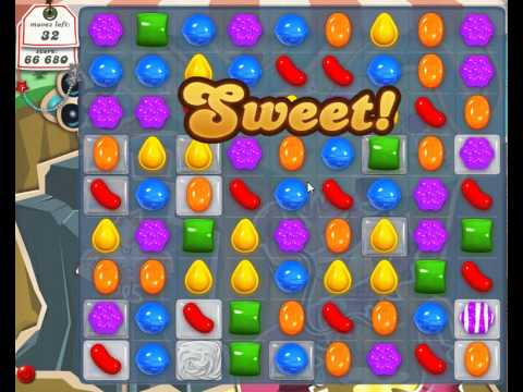
Candy Crush knows how to flatter gamers
Positive reinforcements are not only compliments, but any reaction to a user’s actions. Their main purpose is to reassure users that they are on the right track. Therefore, the term “feedback” would be more accurate when describing those positive reinforcements.
Three types of feedback
There are three types of feedback that are commonly used in user-app communication, and each serves a different goal.
- Progression feedback
- Feel feedback
- Word feedback
Progression feedback (You have read ⅓ of this post!)
Clearly communicating progress is essential for flawless interaction. Users gain confidence when they feel they are on the right track, and this by itself encourages them to keep on going. (Read about the car wash experiment for more details on that phenomena, called “Endowed Progress”).
The use of progression feedback (in its most common form, progress bars) is so ubiquitous that sometimes it is taken for granted and we just forget to implement it when we build our products, even when they are very much needed.
What’s the progression feedback goal?
To help users know where they stand, to acknowledge what they have done so far, and to encourage them to keep on going.
Where to communicate progress?
It’s simple. Whenever there is a finite process you want your users to complete. Be it a registration funnel, a lesson to read, or a boss to kill … stick a progress bar on it for better results.
Below are some screenshots from Tinycards (the new app by team Duolingo), that make heavy use of progression feedback to improve completion rates.
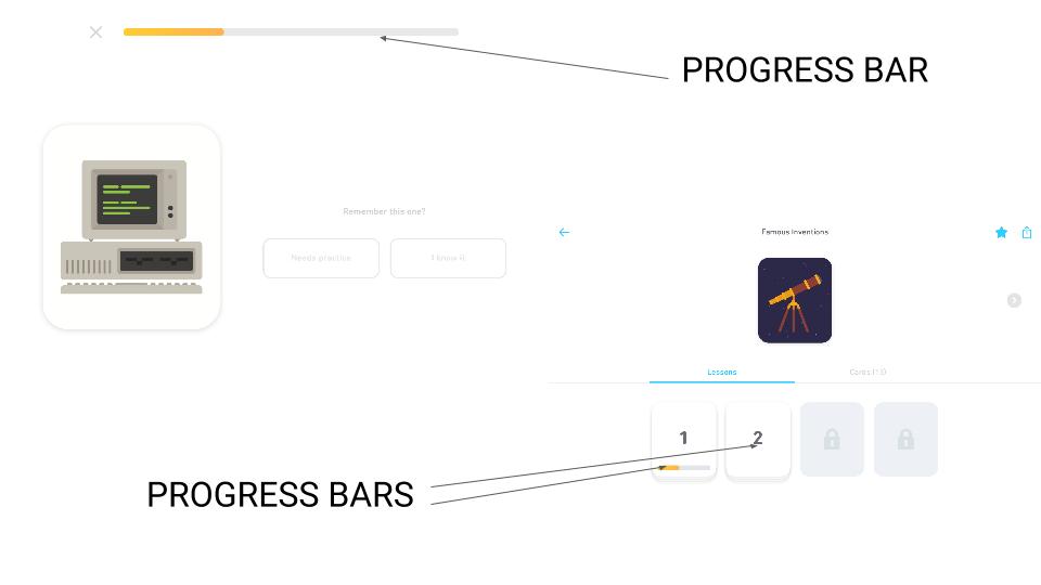
Tinycards is heavy on progress bars
“Feel” feedback
In the mobile era, we communicate with our apps and games through touch, which is a rather intimate communication form. Therefore, desktop design patterns such as hovers, dropdown menus, and hamburger menus won’t do. An application should feel good in the hands of users.
The best examples for great “feel” can be found in games.
Take a simple side-scroll shooting game as an example, where enemies that are hit change their color to solid white for a split second. This color feedback indicates a successful shot.
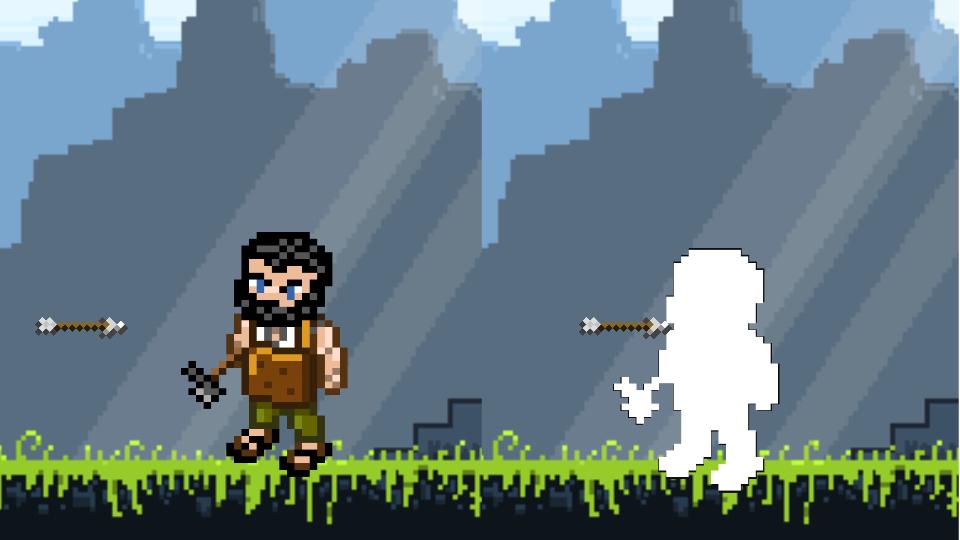
Hit feedback in a traditional shooting game
On the same game, when the player is shooting, the screen performs a soft (or rough) screenshake. This is something that is not always palpable, but users can sense it. If feels right.
Lastly, control over characters (the way they move) is a huge issue in games. For a perfect example, look no further than the British powerhouse duo Laser Dog’s latest mobile game, PKTBALL. The way the character slides across the screen, combined with the slick camera movement, makes this digital toy tremendous fun on mobile devices.
All of this applies, of course, to non-gaming apps. Sliding pictures around, opening menus. All should feel good in the hand of the user.
What’s the feel feedback goal?
Let users know their actions are received and acknowledged by the system without the need for words to communicate that.
Word feedback
Word feedback is the simplest type of feedback to implement. However, so many apps are missing a chance to elevate communication with users and present dull and boring word feedback, instead of something more intimate and fun.
However, some UX designers out there clearly put a lot of thought into word choice.Take this success message by the mailing service provider MailChimp as a perfect example of awesome word feedback.
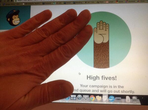
Mailchimp high-fives users
After finishing (the rather long) process of launching an email campaign, instead of a standard “campaign sent!” success message, MailChimp high-fives you. This simple gesture makes a huge change in the way we perceive this service. It takes the vast lines of code of which MailChimp is made and puts a heart in there.
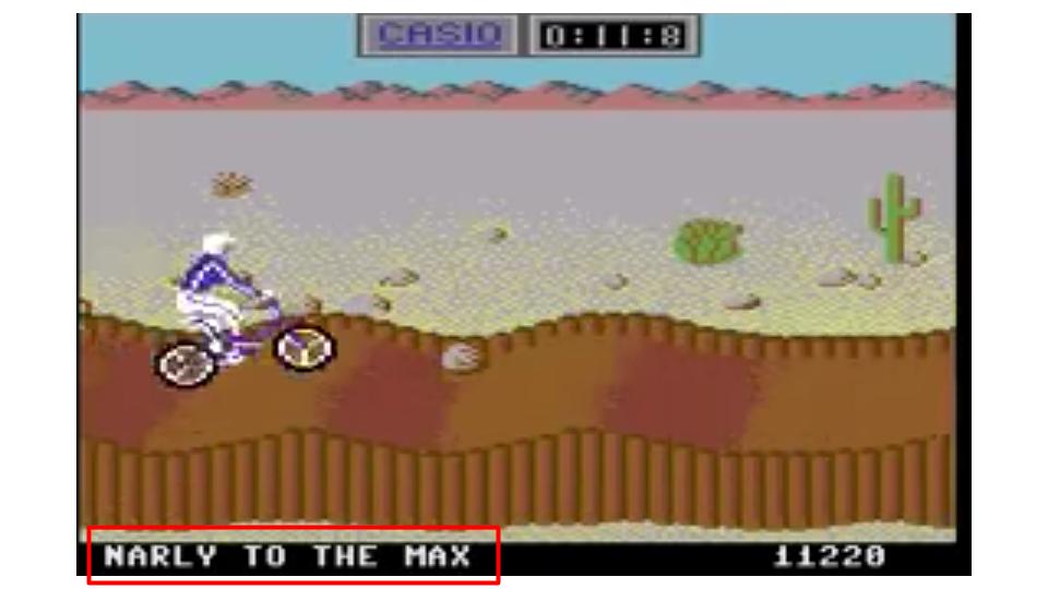
This is, of course, common practice in games, going back to the magnificent “California Games,” a 1987 title that used to go off the roof rooting for you when you made a perfect 360 bicycle jump.
The impact of this positive reinforcement was so strong, because I understood immediately that the game acknowledged my performance. My actions “had meaning” for the software. This was, of course, a great motivator for me to keep on riding and performing psycho flips, 360 turns, and backward flips way past my bedtime.
Ending the post with nostalgia to get some sharing love from my readers 🙂

it was Create. thanks