
Me? paying subscription? to an app? who would have thought.
But in just 10 days, Headspace not only taught me how to meditate,
but how to get users to close their eyes… and open their wallets.
How do they do it?
tl;dr: Superb UX. For details read below:
- What is Headspace?
- The 10 minutes magic
- Headspace’s persuasive UX
- Conclusion
1. What is Headspace?
Headspace is an app for teaching meditation. In their own words:
Headspace is meditation made simple. Learn online, when you want, wherever you are, in just 10 minutes a day.
That’s a very good branding. Let me deconstruct it:
Meditation made simple: Great, cause I’m utterly stupid when it comes to meditation.
Wherever you are: Awesome, I can do it from bed.
10 minutes a day: Yes, I can spare that!
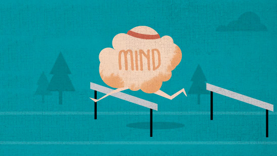
Only 10 minutes a day. The magic words for every busy type. But this is so much more than just a time frame. This is the key to Headspace’s success.
2. The 10 Minutes a Day Magic
Headspace is aiming to lead its users towards mastery in meditation. Breaking this journey into small steps of 10 minutes has several key benefits:
Accessibility
Time is our scarcest resource and 10 minutes a day seems like the perfect time frame in a busy schedule. Less would sound too little. Deceiving, even. More is too big of a commitment. 10 minutes sounds perfect.
Authority
Headspace feels like an authority for meditation. They’ve achieved that with their very well handled design, (see the next paragraph), but that’s also the subtext of “10 minutes a day”. Take 10 minutes a day and you will know how to meditate.
The user doesn’t have to think much, just do as she’s told for 10 minutes. This is a very comforting thing.
A daily habit
The guys at Headspace know that those 10 minutes of meditation have to make it in their users’ habit zone. Otherwise, it won’t last. That’s the main purpose of “10 minutes a day”. Every day. 10 minutes. On top of that, Andy, my Headspace mentor, recommends meditating first thing in the morning. That’s smart. Not only for meditation reasons, it’s also easier to get into people’s morning routine than later in the day. That ensures it’s done. It worked for me. I took Andy’s advice and Headspace was implemented in my morning routine. 10 days later, I was still at it. A new habit was born.
One of Headspace’s animation shorts. Acts as variable rewards
3. Headspace’s Persuasive Design
For this app to work, Headspace has to feel like an authority. Here’s how they do it:
Slick UI
The flat design may not be groundbreaking but it looks very professional. The light tones, characters and animations are as far as they could be from “weird” Indian figures that might scare the western user away. This design conveys authority, science and modernity.
Map progression
Headspace have decided to show user’s progress on a map. Many games use this technique, not so many educational products. I love this solution because it shows a very visual progress and the user sees where she’s heading.
This solution goes hand to hand with the word Journey that is very present in the app. This fits perfectly to the map idea.
* An anecdote about the word Journey, which originates from the french word jornee – a day’s travel. Headspace wants their users to travel a little each day. For this you need a daily habit of traveling… and a map.
Variable rewards
Some lessons begin with a wonderful animation short that educates the user about the process. Those delightful pieces of content enrich the whole experience. The way they are spread across the audio-only lessons gives it a “variable reward” quality. I found myself looking forward to see the next animation, not knowing exactly when it’s going to show and what it’s gonna be about.
Andy’s voice
Each meditation session is conducted by Andy, one of the guys behind headspace. Having him in your ears is a pleasant thing. He is calm, relaxing, not patronizing, and feels personal even when he is catering for 2 million users.
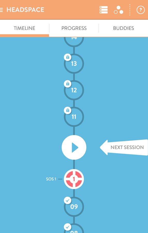
Headspace’s map
4. Conclusion
After 10 days of using Headspace I bought the monthly subscription. Headspace is now officially a part of my morning routine and they have done it with grace, and overall a very good user experience. The key points to take, if you are involved in the EdTech business, is to try to fit the 10 minutes magic to your product. This might lower your users’ barrier to entry and possibly fit in their daily routine. I would also check the map solution as an optional progression indicator.
I encourage you to get Headspace. If not for the UX lessons, for the peace of mind.

you can join me for mediatation free of charge 🙂