

Games and interactive appliances differ from all other mediums in that they require their users to constantly make decisions. As a matter of fact, the decisions’ weight and frequency define the user experience.
// This post was performed live at Celia Hodent’s gameUXsummit last summer. See it here //
Game and product designers take that for granted, to the point they may overlook how decisions affect the overall experience. Hence, they might find themselves with an experience that doesn’t fit their players’ play style, or an onboarding process their users skim through without gaining any substantial knowledge about the product they’ve just onboarded in.
To help me remember not to forget decision design, I’ve created a tool which I fondly call TIMM — The Interaction Mapping Model.
Just before we dive in, some background about the process of decision making.

If you are like most people, you solved that little puzzle immediately. However, were you aware of your decision to start solving it? Well, probably not.
You have just made an automatic decision, like most of the decisions we make in our lives. We walk automatically, drive automatically, sometimes respond automatically, and more often than not, tap that SKIP button automatically.
Now, how about this little equation:
18 * 15 = ?
If you are like most people, you just made a conscious decision not to solve this equation. Why? Our minds are economic machines and would rather save energy when possible. When we encounter calculations, high-stakes decisions, or any decision with consequences, we have to “think hard” about it, thus expending energy.
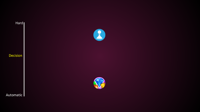
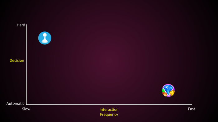
Back to the TIMM model. TIMM is a 2-axis model, in which the Y-axis represents the weight of the decisions, ranging from “automatic” to “hard.”
Chess is a “hard thinking” game, whereas a pattern-recognition game such as Bejeweled Blitz is an “automatic thinking” game.
The X-axis of the model is the frequency of interaction, which is how many decisions a user has to make in any given time, as dictated by the game mechanics.
Chess and Bejeweled may require the same amount of overall decisions; however, the frequency of interaction is completely different. Chess is a slow game. A speed chess match between pros takes about four hours. Bejeweled Blitz is a game that takes only 60 seconds.
Different experiences across the model
Now that you have a basic understanding of how the model is built, let’s define the different experiences across it. We will do this by dividing the model into four equal quadrants.
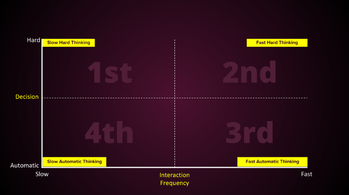
Slow pace, hard thinking
The 1st quadrant is the home for most board games and turn-based games. Playing the game, players would ask themselves questions like, “Where should I go on the map” and “Should I fold, or bluff?”
Since experiences in that quadrant are slow placed, there is room for harder decisions. That doesn’t mean that the experience is laid-back. Quite the contrary. A good design, at least in games, would have players scratch their heads thinking, “Argggggghhhhh! what should I do next??”
Many non-game experiences also live in the slow, hard-thinking quadrant. Take e-commerce websites as an example. Users would ask themselves, while shopping online, questions like, “Do I really need this T-shirt?” and “Will it look good on me?”
Unlike games, the design initiative of e-commerce websites is to remove “thought hurdles” to help their users make hard decisions more automatically. They might add helpful and useful information to the product description, like user reviews or detailed specs, or appeal to their users’ “automatic brains” by claiming that there are “only 3 shirts left in stock.”
Fast pace, hard thinking
Can you think of experiences that live in the 2nd quadrant?
Maybe you will remember your first driving lesson, when everything was coming fast and you had to think hard at every turn?
Or maybe the first time you picked up a guitar and tried to follow up with a recording of your favorite band?
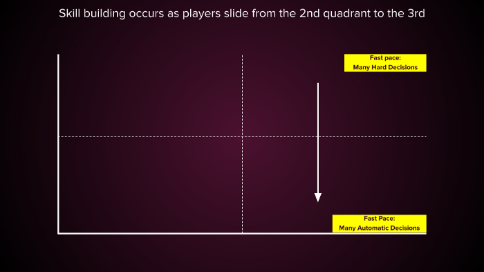
The 2nd quadrant is what I call the “learning quadrant,” as experiences there require users to repeat a lot of hard decisions. Repeat them enough, and these decisions become automatic.
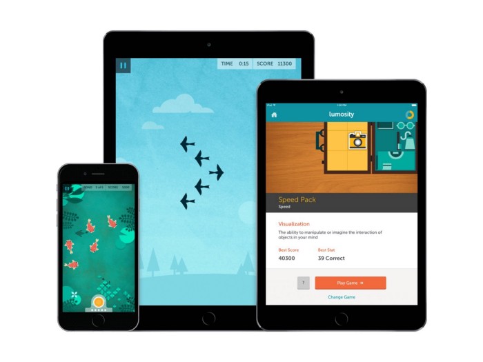
On the 2nd quadrant, we see many training applications. Take Lumosity and Elevate as examples. These are games that bestow a handful of hard-thinking problems on their players in a very short time, with the hope that enough training will get their users’ minds sharp.
Fast and Automatic Thinking
The 3rd quadrant is the home for most digital games and also a few non-game applications.
Think of the decisions you make in many digital games:
- Left or right?
- Jump or not?
- When to tap?
- When to shoot?
These binary decisions require way less energy than hard thinking. In fact, hard thinking would most likely make players perform poorly.
The play experience is mostly very soothing, producing a sense of flow, with little interference caused by the game.
We also see a big movement of non-game applications towards that quadrant, as the desired user experience nowadays is fairly an automatic one. More on that in a couple of paragraphs.
Slow and Automatic Thinking
Which experiences go here?
An extreme example would be slot machines. Slot machines require very little interaction and player decisions are feather-weight. Slot machine players need to decide whether they want to have another go on the machine, and that’s more or less it. The slot machine compensates its players with variable rewards (lose or win different amounts of money), something that is compelling enough to decide YES whenever a decision is required.
This type of experience is not saved for slot machines only.
The experience of scrolling through your Instagram feed, for example, is very similar.
Scroll…scroll…scroll… Interesting picture! Continue scrolling? > Yes!
Scroll…scroll..scroll…
Back to slot machines. The only hard decision a slot machine player has to make playing the game is when she runs out of money and the machine stops. Then, hard thinking is required. Should I add more funds?
If you are a digital slot machine hardcore player, all that you want is for the monetization pop-up to go away. You pay the sum and get back to your machine.

Working within quadrants
When quadrants clash abruptly into one another, like in the slot machine example, it is never perceived as a good user experience. Think about yourself, running in the subway, being fast and automatic because you know exactly where you are heading, when, in the escalators, you find yourself stuck behind a clueless tourist. You are an awesome human being, I’m sure. But at that moment you could have strangled that poor guy.
So clashing quadrants is not recommended (unless you are in it for monetization).
However, that doesn’t mean that experiences should “live” only in one quadrant. The contrary is true.
Take a game like Clash Royale, a live PvP game that mostly lives in the fast and automatic quadrant, as players need to decide fast which card to choose (1 out of 4), when to use it, and where to place it in the arena. (These decisions may seem hard but even novice players seem to grasp them quickly and perform them automatically.).
However, Clash Royale has also a meta-experience that lives deep in the slow and automatic quadrant, in which players build their deck of cards based on their different play styles. People may spend months perfecting their decks.
This is also true for non-game applications.
Take Instagram, which, as stated before, has a core experience that lives in the 4th quadrant, which is the endless feed scroll. However, the act of taking a picture, choosing a filter, and writing a description to go with it belongs in the 1st, slow and hard thinking quadrant.
In both Clash Royale and Instagram, the secondary experience lives in the slow and hard thinking quadrant, and core experience is somewhere in the automatic zone.
Innovating with the model
Since I started working with this model, I’ve discovered it helps me to think differently about products. I have found that I can innovate quite a lot within the model’s constraints.
Take a game like Diablo as an example. It’s a dungeon crawler game in which players hack and slash their way through a maze full of monsters and loot. It’s an experience that lives in the fast and automatic quadrant. What would happen if we dragged that experience all the way to the left?
Non-Stop Knight would happen. Non-Stop Knight is an idle dungeon crawler. Which means that the maze, monsters, and loot are still there, but the computer does the fighting for the player. This means that a lot of automatic decisions like (when to) dash, sprint, hack, and swing are now spared from the players. All that is left are decisions like which armor to equip and when to summon a boss, which are fairly automatic decisions.
(It’s actually quite fun as well! Check out the game here).
What would happen, I wonder, if we dragged Non-Stop Knight from the slow and automatic quadrant up to the slow and hard thinking quadrant? Maybe we could have an idle game based on moral decisions? Or a story-driven, choose-your-own-adventure type of idle game? Up to your imagination.
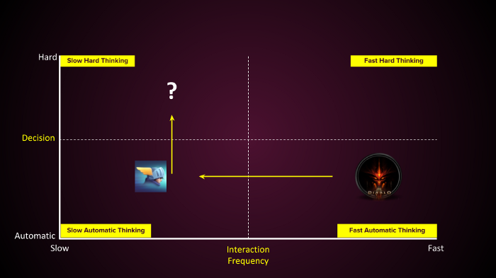
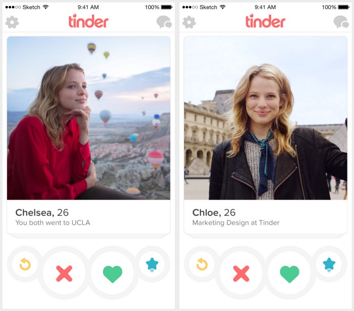
In non-game contexts, we can see plenty of innovation just by dragging experiences around the model. What happens when you take a slow and hard thinking product like the dating website Jdate, and drag it over to the fast and automatic? Tinder happens. Decisions are narrowed to yes/no and the pace is super fast, compared to a more old-fashioned dating website.
How about taking a barely interactive online course, like the ones you can find in Coursera and other websites, and swinging it over to the fast and hard thinking quadrant? You may get an application like Smartly, which teaches courses in economics and business in a very interactive and engaging way.
The future of online education belongs somewhere in between the 1st and 2nd quadrants.
As you can see, “dragging” experience across the model may help you think differently about the experiences you want to make.
How I use the model in my work — GoCube case study
GoCube is a magical* physical Rubik’s cube that connects to the phone via Bluetooth.
Connected, the GoCube app on the phone “knows” the exact state of the physical cube at any given moment and can use this knowledge for plenty of cool stuff.
* Not really magical but a super smart product done by tech wizards. See the Kickstarter here.
One of the cool things that the makers of GoCube promised their backers in the successful Kickstarter campaign was an interactive tutorial that would help newbies solve the Rubik’s cube riddle for the first time in their lives. But if you think solving a cube is hard, teaching how to solve it is much harder.
One of the things that have become evident during playtests is that for players to solve the cube, they need to have very good knowledge of how notations work. Notations are “the language of the cube.” They tell players which face of the cube to move and in which direction.
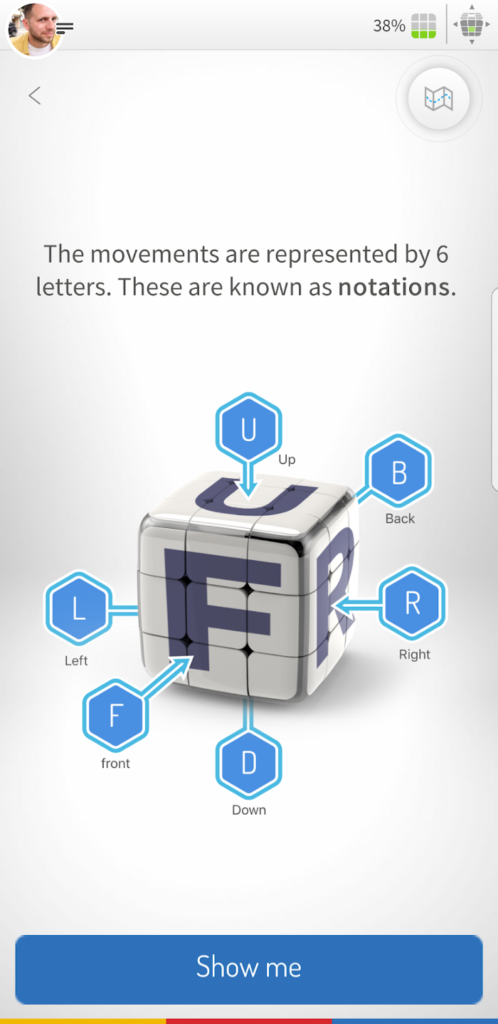
Notations seem easy, but they are actually quite confusing. If players can’t perform them automatically they are likely to get lost in our tutorial. The only way to get players to perform notations automatically is by crafting an experience that lives in the 2nd, fast and hard thinking quadrant. So, we’ve made learning notations — a race!
In a PvP race, two players follow a series of instructions in the form of notations. Whoever does it faster wins the race.
This scheme puts players in the middle of the 2nd quadrant. They have to think fast, and when the mind and hand are not yet correlated, this action takes its share of cognitive load.
As players get better, they face stronger opponents, who push them back up out of their comfort zone to the 2nd quadrant, from which they will slide down again as they improve.
The race proved compelling enough for players to spend a lot of minutes and repetitions in it. So when they are done and back to the cube tutorial, their knowledge of notations has become almost automatic. Alas, by fixing one problem we have created another.
Armed with the new knowledge, players were following orders too fast without thinking. They were being too fast and automatic.
Many would solve the cube but did not understand how they’d done it.
So, we broke the fast and automatic flow by breaking our own patterns, bestowing little challenges on our players while they learned how to solve it.
This has made the tutorial longer. But players who finished it reported they felt more confidence in solving the cube.
That problem of being too fast and automatic during the tutorial is something that many games and non-game apps share. From the data point of view, it seems like there’s no problem. The majority of players/users finish your onboarding. But do they really know how to use the product, or understand its value after completing it?
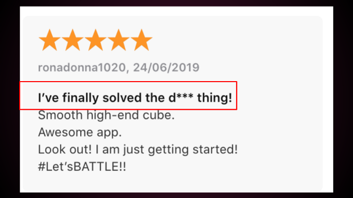
Back to the cube… 90% of players who have engaged with the notation contest have finished solving the cube, many of them for the first time.
A lot of the reviews were addressing this specifically.
Summing up
Since I’ve started to use this model extensively in my work, I often see my life decisions reflecting in it.
There are slow and hard thinking moments when I try to understand where I navigate my business, which clients I should take, and what courses I should launch.
As a father, there are fast and hard thinking moments, as I try to react appropriately when my son is absolutely driving me nuts. Albeit most of the time, it is just fast and automatic for me. Running errands, buying diapers, taking my kids to kindergarten and generally doing as I’m told, waiting for the day to be over so I can turn on Netflix and become slow and automatic.
Where are you at?
Where does your app, service, or game belong in the model?
Share in the comments!
This model was first presented at #gameUXsummit, Lille, France. If you are a UX person that loves games, don’t miss that conference!
